A New Look to the Home Page
The Home page for The Family History Guide doesn’t change often, but it now has an updated look that especially helps those who may be new to the site. Let’s take a look at what has changed in the Home page, and what hasn’t.
Top (or Side) Menu
Those who have been using The Family History Guide for a while will probably be glad to know that the menu system has not changed. It still has the same structure and items, whether at the top for laptops and desktops, or on the side (three-line button) for tablets or phones.
Concise Format, 1 Click to Get Started
The main picture is now vertically shorter, for less scrolling, and a side-by-side format is used at the top of the page. The biggest change is the “Click here to get started” link, which takes you to the newly revamped Get Started page. A reminder appears below the link, emphasizing that you can also use the top (or side) menu for navigation on the site.
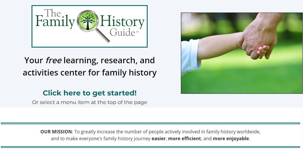
The rest of the Home page is pretty much unchanged. There is the 3-column list of links and text, followed by the footer at the bottom of the page.
Get Started: Action Tiles
Some feedback we heard occasionally was that new users to the site were sometimes unsure of what to click first. On the new Get Started page we now have three rows of action tiles that provide easy, visual choice for ways to get engaged with The Family History Guide. Row 1 is First Steps; Row 2 is Learn and Explore; and Row 3 is Activities and More.
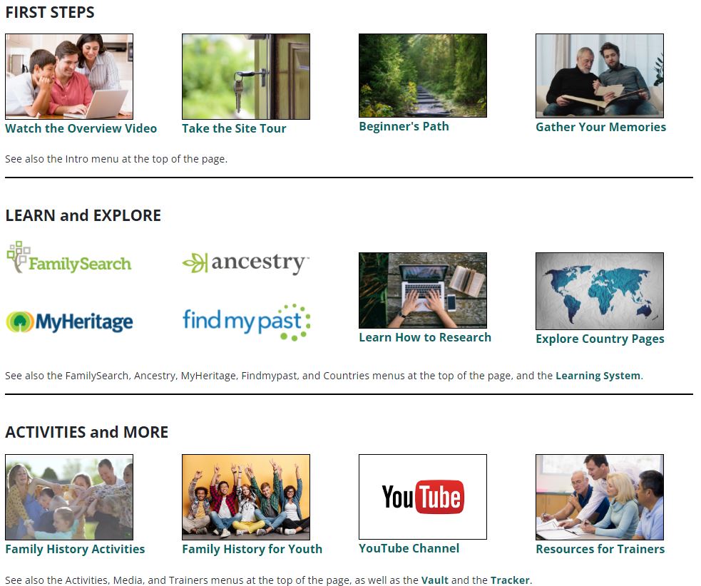
Notice that at the bottom of each row of action tiles there is a reminder that the action items can also be found in the top menu (or side menu for tablets and phones). This helps new users make the transition to using the menus for convenience, if they prefer. There are also links to the Learning System, Vault, and Online Tracker.
We hope you enjoy the new Home page look. If you like The Family History Guide, be sure to share it with your friends and family!